#Android Advanced Preference Kit
All preference implements lock system. It is designed to lock any preference for example in a free version of your app. It means that if you lock a preference via setLocked(boolean) or via xml attribute "locked", the preference will be disabled and an icon will be displayed in the top end corner showing a padlock. A custom icon can be set via methods setLockedIcon(Drawable), setLockedIconResource(int) or via xml attribute "lockedIcon". The user will not be able to interact with a locked preference.
####See:
###Including this library in your project Put the binary file as follows:
yourModule/libs/PreferenceKit-1.1.aar
Then in:
yourModule/build.gradle
add following dependency:
dependencies {
    compile ':PreferenceKit-1.1@aar'
}
##Preference (Base) All preferences provided in this library extends this preference, so they all have these attributes, even if they are not re-precised for each preference #####Xml attributes
- name: "locked", type "boolean", default: "false", descr: Sets preference locked or not.
- name: "lockedIcon, type "drawable", default: "internal icon", descr: Sets the lock icon.
##SpinnerPreference
 #####Xml attributes
- name: "entries", type "string-array", descr: Values to display in spinner.
- name: "entryValues", type "string-array", descr: Values to store in shared preferences.
- name: "showValueInSummary", type "boolean", defaultValue: "false", descr: If set, the value is shown as summary.
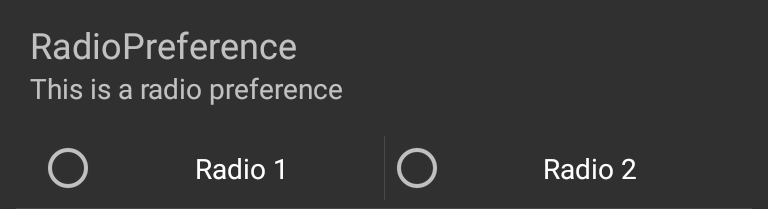
##RadioPreference
 #####Xml attributes
- name: "entries", type "string-array", descr: Values to display in radio buttons.
- name: "entryValues", type "string-array", descr: Values to store in shared preferences.
- name: "showValueInSummary", type "boolean", defaultValue: "false", descr: If set, the value is shown as summary.
##ColorPickerPreference
 #####Xml attributes
- name: "alphaAllowed", type "boolean", defaultValue: "true", descr: Sets if alpha bar is available when picking color.
- name: "saturationAndValueAllowed", type "boolean", defaultValue: "true", descr: Sets if saturation/value bar is available when picking color.
##SeekBarPreference
 #####Xml attributes
- name: "maxValue", type "int", defaultValue: "100", descr: Sets SeekBar max value.
- name: "showValue", type "boolean", defaultValue: "true", descr: If set, value is displayed next to SeekBar.
- name: "knobColor", type "color", defaultValue: "system default", descr: requires API level 16. If set, seekBarColor will be replaced.
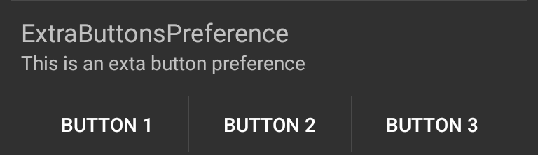
##ExtraButtonsPreference
This preference only provides extra buttons, it doesn't store any data. It can be useful for launching intents such as playsotre
intent for app, and playstore intent for developer page in the same preference row. A CharSequence array is required, it corresponds to each button. It can be set via
code with setButtonLabels(CharSequence...) or setButtonLabels(int), or via xml with "buttonLabels" attribute. Button clicks can be
listened through OnExtraButtonClickListener interface, by using setOnExtraButtonClickListener(OnExtraButtonClickListener) method.
 #####Xml attributes
- name: "buttonLabels", type "string-array", descr: Values to display in buttons.
##NumberPickerPreference #####Xml attributes
- name: "maxValue", type "int", defaultValue: "100", descr: Sets NumberPicker max value.
- name: "minValue", type "int", defaultValue: "0", descr: Sets NumberPicker min value.
- name: "wrapSelectorWheel", type "boolean", defaultValue: "false", descr: Sets whether the selector wheel should wrap around the minValue and maxValue.
- name: "editableValue", type "boolean", defaultValue: "false", descr: Sets if user can use SoftInput to set a value.
- name: "showValueInSummary", type "boolean", defaultValue: "false", descr: If set, the value is shown as summary.
- name: "selectionIndicatorsColor", type "color", defaultValue: "#ff80cbc4", descr: Define NumberPicker's dividers color, ignored for devices lower than Jelly Bean (Api 16).
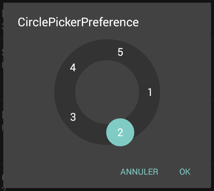
##CirclePickerPreference
This preference allow user to pickup an integer on a wheel of numbers. Obviously this is not design to work with a big amount of numbers.
It has been designed to replace the ugly ICS number picker when choosing integer in a small range.
 #####Xml attributes
- name: "maxValue", type "int", defaultValue: "100", descr: Sets NumberPicker max value.
- name: "minValue", type "int", defaultValue: "0", descr: Sets NumberPicker min value.
- name: "showValueInSummary", type "boolean", defaultValue: "false", descr: If set, the value is shown as summary.
##DoubleCirclePickerPreference Exactly the same as CirclePickerPreference but with two wheels. To access persisted data in your app, you need to use DoubleCirclePickerPreference.getValuesFromPersistedData(). Example:
    int defaultRow = c.getResources().getInteger(R.integer.home_row_count);
    int defaultCol = c.getResources().getInteger(R.integer.home_column_count);
    String defaultValue = DoubleCirclePickerPreference.createPersistValue(row, col);

    return DoubleCirclePickerPreference.getValuesFromPersistedData(preferences
            .getString(Constants.PREF_GRID_ROW_COL_COUNT, defaultValue));
- name: "maxValue1", type "int", defaultValue: "100", descr: Sets first NumberPicker max value.
- name: "minValue1", type "int", defaultValue: "0", descr: Sets first NumberPicker min value.
- name: "maxValue2", type "int", defaultValue: "100", descr: Sets second NumberPicker max value.
- name: "minValue2", type "int", defaultValue: "0", descr: Sets second NumberPicker min value.
- name: "showValueInSummary", type "boolean", defaultValue: "false", descr: If set, the value is shown as summary.
##RadioPreferenceGroup
Group of radio based preferences, only single radio preference is checkable in group. It is the same idea as RadioGroup class, but for preferences.
Persisted value is the index of checked radio preference.
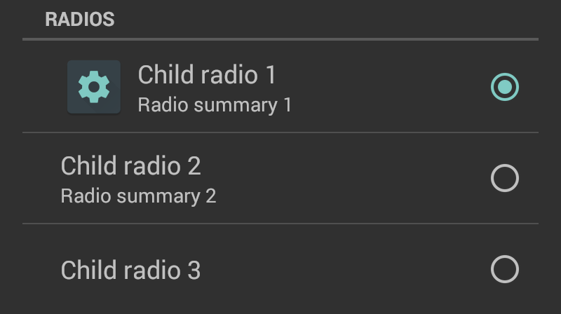
- name: "titleColor", type "color", descr: group title color.
- name: "radioTitles", type "string-array", descr: child titles, must be set.
- name: "radioSummaries", type "string-array", descr: child summaries, optional, can contains null elements.
- name: "radioIcons", type "array", descr: child icons, optional, can contains null elements.
##License
 Copyright 2016 MajeurAndroid

 Licensed under the Apache License, Version 2.0 (the "License");
 you may not use this file except in compliance with the License.
 You may obtain a copy of the License at

 http://www.apache.org/licenses/LICENSE-2.0

 Unless required by applicable law or agreed to in writing, software
 distributed under the License is distributed on an "AS IS" BASIS,
 WITHOUT WARRANTIES OR CONDITIONS OF ANY KIND, either express or implied.
 See the License for the specific language governing permissions and
 limitations under the License.
This library use awesome HoloColorPicker library developed by Lars Werkman.